What are the pages that make up an eCommerce site?
The home page, product page, shopping cart, and checkout are the most important ones that come to mind.
What else is there to say?
We evaluated e-commerce websites we’ve created over the years as well as a number of prominent e-commerce websites to create a master site map of every page that should be included in an e-commerce website.
- We Picked 25 Pages That We Believe Should Be Included on Any E-Commerce Website
- 1. Home
- 2. Category Overview
- 3. Category Page
- 4. Product Page
- 5. Search and Search List
- 6. Login and Create an Account
- 7. Add to Cart Confirmation Element
- 8. Cart Page
- 9. Log In/ Guest Check Out
- 10. Shipping
- 11. Payment
- 12. Review
- 13. Confirmation
- 14. My order and order history
- 15. Individual Order View
- 16. My Profile/Account Setting
- 17. Payment Setting
- 18. Addresses
- 19. Email Sign-Up
- 20. Returns
- 21. Shipping
- 22. Help/Contact Us
- 23. Store Locator/Where To Buy
- 24. Store Details Page
- 25. Terms and Conditions and Privacy Policy
We Picked 25 Pages That We Believe Should Be Included on Any E-Commerce Website
1. Home
There’s no denying that the homepage is crucial. It’s frequently a brand’s initial impression, and it’s normally the first page to tackle in an e-commerce design.
Promotions, branded lifestyle photography, and featured products or categories can all be found on the site. Free shipping, for example, or what makes the brand or items distinctive should be obvious value propositions.
While the homepage is considered the site’s front door, keep in mind that visitors may arrive via direct connections to other pages rather than the homepage.
2. Category Overview
This is the home page for a top-level category, such as Women or Electronics, which shows an overview of what’s available rather than listing all of the products.
If there are more than two tiers, such as Women’s > Tops > Sweaters, multiple Category Overview pages can be used. You can skip the Category Overview page and move straight to the Category page if your categories are only one level deep (next).
3. Category Page
The Category page displays a list of products for a given category or subcategory, usually in a grid format. It frequently incorporates filters, allowing the user to go down and locate exactly what they’re looking for.
In contrast to the Category Overview, which focuses on advertising and wayfinding, the objective of this page is for the visitor to browse and see a large number of products at once.
4. Product Page
The Category page displays a list of products for a given category or subcategory, usually in a grid format.
It frequently incorporates filters, allowing the user to go down and locate exactly what they’re looking for.
In contrast to the Category Overview, which focuses on advertising and wayfinding, the objective of this page is for the visitor to browse and see a large number of products at once.
5. Search and Search List
E-commerce sites, especially those with a large number of products, should feature search capabilities. In most cases, the search field is found in the navigation menu.
Consider how the results are displayed on the Results page. This page is frequently based on the Category Page template, but it may also have its own design.
6. Login and Create an Account
Customers can save data such as order history and payment information on e-commerce sites with account functionality, as well as engage in other activities such as wish list management, the accumulation of rewards/loyalty points, and unique access to specials.
The login/create account form can be treated as modals or dropdowns, or it can be placed on its own page. Make sure that making an account is accessible from the login fields (and vice versa) so that if a person forgets their password, they can quickly navigate to Create Account.
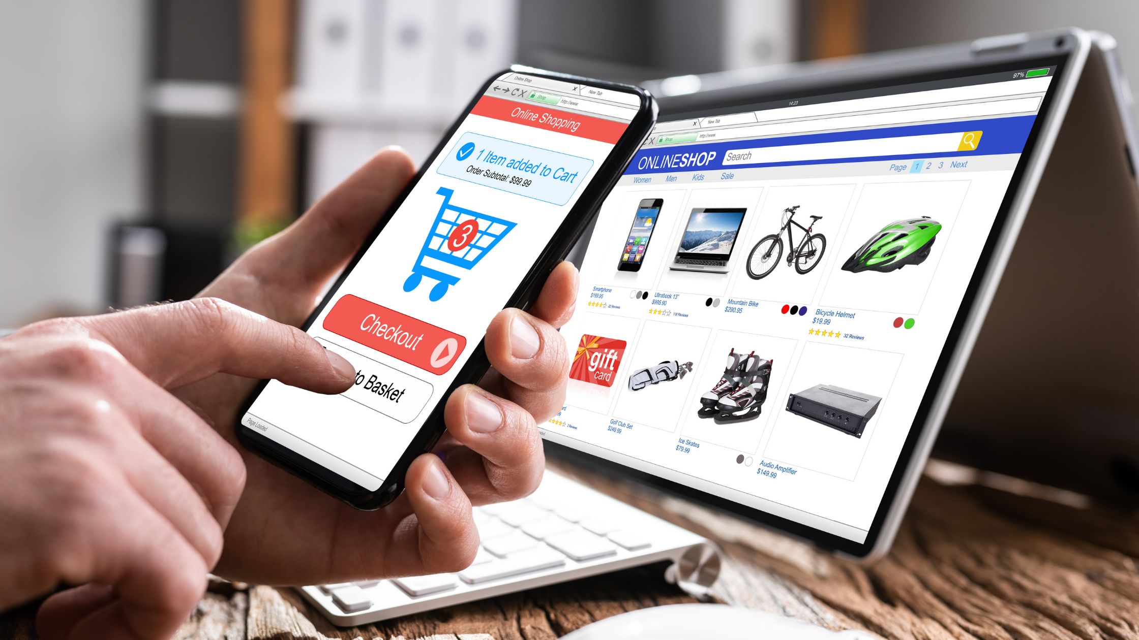
7. Add to Cart Confirmation Element
Although this isn’t exactly a page, it’s an essential view to provide. When a consumer adds an item to their cart, it’s critical to provide visual feedback.
A dropdown or fly out from the cart symbol in the nav, or a modal on the page, are common examples. Recap what was added and update the cart subtotal to keep it informative.
This is also a wonderful way to encourage the customer to keep browsing by displaying how close they are to receiving free delivery and displaying relevant products.
8. Cart Page
The shopping cart should have a list of everything the user has added, as well as the opportunity to make modifications.
You don’t want people abandoning the checkout process because they discovered the cost of taxes and shipping, as well as the fact that their discount code didn’t work–inconvenient it’s for both the shop and the customer. Upselling related products can also be done on the basket page.
9. Log In/ Guest Check Out
After the user has reviewed their basket, it’s a good idea to prompt them to log in (if they haven’t previously) so they can have a faster checkout experience by using the saved information.
If a user does not want to create an account or remember their password, allow them to checkout as a guest, which will require them to fill out all of their information.
10. Shipping
The form fields used to collect shipping addresses are included in the shipment phase. Using the shipping address as the billing address is commonly a checkbox.
11. Payment
Form fields for entering payment information are included in the payment stage. This could contain fields for entering billing information, especially if it differs from shipping information.
Include the option to pay using rewards points or shop credit, as well as submit gift cards or promo codes.
12. Review
This is a key phase in the purchasing process since it allows you to evaluate all of the things you want to buy, as well as the delivery information, payment method, discounts, and any additional fees such as taxes or express shipping.
Make it clear that this is a review stage and that the primary call to action is to place an order.
See Also: The Internet of Things For Beginners
13. Confirmation
Various than a thank you message, confirmation pages can be used to display other messages. Something could go wrong while the system processes the order, and the site will need to return an error page rather than a confirmation page to convey that an item has sold out by the time the order was made.
14. My order and order history
The Orders tab displays all current orders as well as all previous orders, allowing the user to review previous purchases.
15. Individual Order View
This page functions similarly to a receipt for a specific order. It should include all of the data for the order, from what was purchased to where it was delivered.
16. My Profile/Account Setting
This page, whether named “My Profile,” “My Settings,” “Account Information,” or something else, has all of the fundamental account data, such as name, email, and password change.
17. Payment Setting
The Payment Settings (or Manage Payment) page displays saved payment information (gathered from past orders) and allows you to edit or delete it.
18. Addresses
The Addresses tab displays a list of remembered shipping addresses (also acquired from past orders) that you may edit or delete.
19. Email Sign-Up
In the world of e-commerce, email is a vital lifeline. It’s a certain approach to ensure repeat business and market to interested prospects.
Make it simple for visitors who are interested to sign up. A simple field in the footer or a pop-up modal can be used instead of a dedicated page.
20. Returns
Returns are a vital element of online buying, which is why a clear link to them should always be present in the footer.
This page should also be available during the checkout process, as cart abandonment can occur when a user is unsure about the return policy and is unable to complete their purchase with confidence.
21. Shipping
The shipment time and cost are two of the most frequently asked questions by online consumers, so make sure there’s a page dedicated to shipping information that’s easy to access (often in the footer, like returns).
It should also contain details on international shipping policies and any special shipment timetables for holidays.
22. Help/Contact Us
Customers should have a centralized location to identify ways to contact customer service, whether it’s via email, phone, form, or live chat.
Many websites combine FAQs with Contact Us to provide answers to questions that have been asked often in the past (and also to save time).
23. Store Locator/Where To Buy
Some visitors will come to the site solely to discover a store near them if there are real retail locations.
Similarly, if the brand doesn’t have its own physical store and instead sells its products through other merchants, it’s critical to create a page where customers can find out who carries the brand and where they can purchase it.
24. Store Details Page
Provide detailed facts about a specific store, such as a map and business hours, as you dig down from the Store Locator page.
25. Terms and Conditions and Privacy Policy
Remember to add the legalese, as with other websites.
Conclusion
The following list includes everything that’s required on a basic level, but an e-commerce site may require much more depending on the things it offers and the brand’s and store’s specific aims.