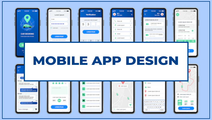
Creating a mobile app design is not just a technical endeavor. You have to be very human in your approach.
The more you observe user behavior during research, the better it will be for your own app design.
The UI and UX designer needs to understand the human emotions which play a major role in using any technology.
Here are a few things to keep in mind to ensure that your mobile app design is a hit among users.
Keep the Navigation Simple

You should make sure that users are able to find everything that you have to offer. You have to make the interface easy enough to be explored.
It is always recommended to use navigation patterns that users are already familiar with.
If you use standard patterns for navigation, users are more likely to know what to do and how to explore your application.
Navigation options should be clearly visible to all users at all times.
Make sure users know where you are in the app at any given moment.
You can highlight the name of the section or subsection where you are exploring.
A lot of UX designers try to embed animations as a part of the interface.
Need to more, Please read the full blog
Best UI/UX Design Tips For Mobile Apps In 2022
Gestures are hidden and if you make them work like a navigation option, the user experience is more likely to be terrible.
Your app should have visible controls. The user may get irritated with gesture control.
If you have this feature, it should be optional. Primary navigation features should always be standard and familiar to the user.
You can use animations to enhance the experience, but not as basic features.
First-Time Experience Is the Key to Success

First impressions are the most important for any app experience.
The initial or the first window is where most users decide whether they are going to use the app or not.
Surveys have shown that almost a quarter of all users abandon an app just after using it once.
Here are a few things you can do to ensure this
· Don’t ask the user to sign in on the first window
· Only ask what is absolutely necessary to use the app
· Delay the sign-in process to give users more experience with the features
· Offer a satisfying onboarding experience
· Don’t make many things compulsory to use the app
· Let users have a feel of the app with a quick test of features
· Don’t ask for permission in the initial steps
· Only ask for relevant permissions in the right context
· Explain why each permission is needed
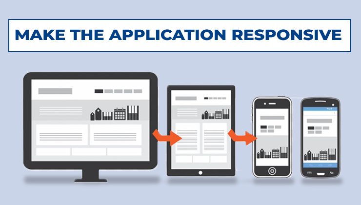
Make the Mobile App Design Application Responsive

Make sure that users don’t have to wait for things to get loaded. According to a user behavior survey, almost half of all users expect an app page to load in about 2 seconds or less.
Most users abandon the app if they have to wait for a long time. High speed and smooth information flow should be your priority while designing an app.
Apps that work swiftly have more success. If there is a chance of a delay for any reason possible, make sure you have pre-defined responses.
You should let the user know when things are loading. You can use a spinning icon if the waiting time is short.
If the waiting time is long, you can show a progress bar with the percentage icon.
Alternatively, you can also distract the user while waiting. This can be done by using interesting animations. Users should always feel in control.
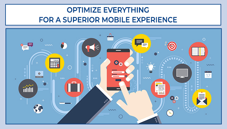
Optimize Everything for a Superior Mobile Experience

Offer clearly made content fit for mobile consumption. Ensure that the text is readable and pleasant to look at.
· Make sure that the font size is not too big or small
· Choose an easy-to-read font like Roboto or San Francisco
· Give the right contrast to the text since it will be easily readable
· Make sure that the contrast is just perfect and not too high or low
· Don’t capitalize the whole content
· Keep the lines short according to keep things mobile friendly
· Keep the right spacing between the lines and words so that text doesn’t feel squeezed
· You should only use high-quality images and that too in the right resolution
· Make sure you put the images in the right aspect ratio so that everything goes in the right place
Optimize Your App for the Best Touch Experience
· Minimize incorrect inputs by creating a well-designed interface
· Make the app more comfortable to use by giving large enough touch icons
· The app should be designed for fingers and not a mouse pointer
· The screen should be easy to tap
· Don’t put small icons in the corners of the screen
· Keep the icon size 10 mm by 10 mm
· Keep enough space between icons like “accept” and “reject”
· Ensure that you keep into account the natural range of motion for the thumb
· Keep the most features in the natural thumb range
· Don’t keep essential features where you have to stretch the thumb
While using the app, the experience should be interactive. Improve Your Mobile SEO and Boost Conversions. Users expect the application to be responsive.
This is a digital experience and every action should have feedback for the user.
The user should know that things are moving and the experience should be dynamic. The app should feel like interacting with a living entity.
You can use haptic feedback or vibration when you do a certain action.
Think about how the user feels while working with the tool. The app experience is not just about what happens on the screen, but how the user feels while working with it.
